
Responsive Website Mockup: A Comprehensive Guide
In today’s digital landscape, where users access websites from a multitude of devices, having a responsive website is no longer optional but a necessity. A responsive website ensures that your website provides an optimal user experience regardless of the device or screen size. To achieve this, designers and developers utilize responsive website mockups to visualize and validate the website’s layout, functionality, and responsiveness.
What is a Responsive Website Mockup?
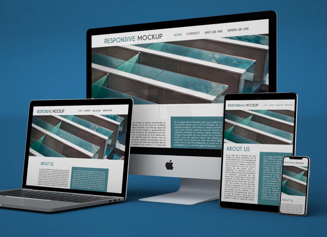
A responsive website mockup is a high-fidelity representation of a website that accurately reflects how it will appear and function on different devices and screen sizes. It serves as a blueprint for developers to build the actual website, ensuring that the final product aligns with the intended design and functionality.
Benefits of Using Responsive Website Mockups
- Improved User Experience: Mockups allow you to test and refine the website’s layout, navigation, and content presentation to ensure optimal usability across all devices.
- Enhanced Visual Appeal: By visualizing the website’s design, you can make informed decisions about typography, color schemes, and imagery to create a visually appealing experience.
- Reduced Development Time: Mockups provide a detailed roadmap for developers, reducing the need for extensive revisions and minimizing development timelines.
- Increased Collaboration: Mockups facilitate collaboration between designers, developers, and stakeholders, ensuring that everyone is aligned on the website’s vision and functionality.
- Faster Time-to-Market: By streamlining the design and development process, mockups help businesses launch their websites more quickly, gaining a competitive edge.
Steps to Create a Responsive Website Mockup
- Define the Project Scope: Determine the website’s purpose, target audience, and key features.
- Gather Content and Assets: Collect all necessary text, images, and other assets to populate the mockup.
- Plan the Layout and Structure: Sketch out the website’s overall layout, navigation, and content hierarchy.
- Create Wireframes: Develop low-fidelity wireframes to define the website’s structure, page flow, and functionality.
- Design Visuals: Add visual elements like typography, color schemes, and graphic assets to elevate the mockup’s aesthetic appeal.
- Test Responsiveness: Preview the mockup on different screen sizes and devices to ensure optimal display and functionality.
- Iterate and Refine: Gather feedback and make necessary adjustments to improve the mockup’s usability and visual impact.
Tools for Creating Responsive Website Mockups
- Adobe XD: A popular tool for creating interactive prototypes and mockups with extensive responsive design capabilities.
- Figma: A collaborative design platform that allows teams to design, prototype, and share mockups seamlessly.
- Sketch: A vector-based design tool with plugins specifically tailored for responsive design.
- InVision: A prototyping tool that provides advanced features for interactive mockups and user testing.
- Framer: A code-based tool that allows designers to create highly interactive and dynamic mockups.
FAQs about Responsive Website Mockups
Q: Are responsive website mockups different from wireframes?
A: Yes, wireframes are low-fidelity representations that focus on the website’s structure and functionality, while mockups are high-fidelity designs that incorporate visual elements and provide a more realistic preview of the final website.
Q: How detailed should a responsive website mockup be?
A: The level of detail depends on the project’s requirements. However, a good mockup should include all essential elements, such as navigation, content hierarchy, typography, and key visual elements.
Q: Can I use a responsive website mockup to create the actual website?
A: While mockups provide a solid foundation, they are not directly translatable into code. Developers need to build the website based on the mockup’s design and specifications.
Q: How do I ensure the mockup accurately reflects the final website?
A: Collaborate closely with developers throughout the process, provide clear specifications, and test the mockup on multiple devices to minimize discrepancies.
Q: What are some best practices for creating effective responsive website mockups?
A: Use grid-based layouts, design for multiple breakpoints, optimize images for responsiveness, and ensure accessibility across all devices.
Conclusion
Responsive website mockups are indispensable tools for designing and developing websites that provide a seamless user experience across all platforms. By carefully crafting and iterating on mockups, businesses can create websites that not only look great but also function flawlessly, delivering exceptional results and driving success in the digital realm.


